


If you think that it is a trivial task to center grid content and align its items without JavaScript, think again.
Recently I have needed to create a responsive grid with the following requirements:
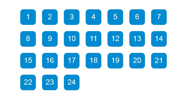
- content is always in the center of the parent container
- the grid has equal square items with fixed size;
- without space between the items (for visual convenience there is an equal margin between the items in the example below);
- items have left alignment;
- the grid must be responsive.

It is challenging to apply two alignments on a grid without using JavaScript. I have tried CSS Floats, but I could not manage absolute centering of the grid. I have tried and using 'inline-block' value of the display property on the grid items but could not manage left alignment.
I found two pure CSS solutions. First one is with CSS Grid and the second one is with CSS Flexbox. In the codepen.io example, the CSS is split into visual sugar and actual aligning.
On both solutions, I am using wrappers with classes - grid and flexbox. Their items respectively have the class box.
CSS Grid
Using CSS Grid is the most natural way to achieve our goal without any 'hacks,' but with one major downfall. It is not supported by Internet Explorer.
CSS Grid is not practical in most cases when you need to support Internet Explorer 11. It is because you need to set fixed position explicitly on every item (box). By doing that using CSS Grid is no more different than using property position with value absolute.
To center the grid we use property justify-content with value center on the wrapper. The tricky part is to align the containing items on the left. Here is the beauty in just one line:
grid-template-columns: repeat(auto-fill, 100px);The line is again applying in the container and means that grid is auto-filling the available space with as many columns as it can with width 100px. Because items have fixed size of 100px, it does not matter if we use auto-fill or auto-fit.
CSS Flexbox
If you need to support Internet Explorer 11, you need to use this solution, but it contains a little hack that you might not like.
We use again justify-content with value center like in CSS Grid solution. Unfortunately, all items are centered too, so we need to fake left alignment.
To align items to the left, we need to add additional 'dummy' items. These items are the hack I was talking about at the beginning.
In the example, I have added 10 mysterious div tags with class empty-box. Notable is the width that is the same as the other items and height of 0.
Because all items are still aligning to the center, we must equal the number of items with fake ones. The number of these empty div tags depends on the last row and the number of items we need to fill.
For example, if we have 2 rows of 8 columns and the second row has only 2 items, we need to add at least 6 empty items to fill the last row. By adding items, we are pushing the existing ones to the left. Adding less empty-box divs cannot push the 2 items all the way to the left side. Adding more empty-box divs is not changing the grid because the grid is creating extra rows with the height of 0.
This part is the hacky one, using additional HTML tags means you separate logic into CSS and HTML. The only workaround is with fixed container/wrapper width, but then it defeats the purpose of creating a more generic grid.
Finally, you can always use JavaScript and save time, but again where is the fun of that?
See the Pen Center grid and align items on the left by Pantaley (@pantaley) on CodePen.


